


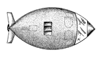

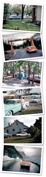
SATURDAY, JULY 28, 2007
The easy way to move a load is with a truck that’s built to fit the load. It’s always easy with a Dodge “Job-Rated” truck! Facts show why . . .
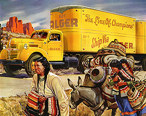
From 1947, a nice illustration by an unknown artist of a double trailer somewhere in the Southwest. Geo. F. Alger was a real trucking company, still in existence and based in Michigan.
FRIDAY, JULY 27, 2007
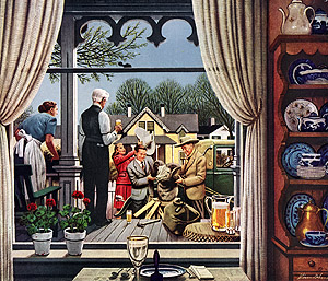
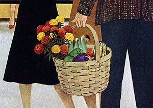
In this home-loving land of ours . . . in this America of kindliness, of friendship, of good-humored tolerance . . . perhaps no beverages are more “at home” on more occasions than good American beer and ale. For beer is the kind of beverage Americans like. It belongs — to pleasant living, to good fellowship, to sensible moderation. And our right to enjoy it, this too belongs — to our own American heritage of personal freedom. Beer belongs . . . enjoy it!
From 1946 and Stevan Dohanos comes the very first in a series of over 100 paintings by noted illustrators commissioned by the U.S. Brewers Foundation as part of a decade-long marketing and lobbying effort to promote (and permit) the retail sale of beer in places other than liquor stores, at a time when two developments were bringing beer out of taverns and restaurants and into the living room: The spread of self-service supermarkets and the arrival of the home refrigerator as a mass-market appliance. The beer and ale makers of America, seeing the potential for a huge new market, came together under the Brewers Foundation umbrella and launched the “Beer Belongs” campaign, which depicted the consumption of beer in a variety of wholesome, homey settings — just about everywhere except in a bar.
THURSDAY, JULY 26, 2007
≈
The Little Man Who’s Always There
![]()
If you’ve had difficulty getting your favorite flavor of Karo Syrup, here’s the little fellow who is responsible. He has had little to do with the quantity of Karo America is demanding, but he has everything to do with keeping up its quality. While Karo is widely used in infant feeding, babies actually consume only a small part of the millions of pounds produced every year. But any single drop of Karo may find its way into a baby’s bottle. So, every drop of this delicious, nutritious syrup must be of the highest purity. Keeping up this standard of quality keeps down the quantity we can produce. Our great syrup plants are operating full speed 24 hours every day. And still the Army, the Navy and the housewife call for more and more as hard-fighting, hard-working Americans turn to Karo for sweetness, for flavor, for quick energy. So, if you cannot always buy Karo, please be patient. Remember that when you do buy genuine Karo, it is the same pure, nutritious syrup you have always enjoyed. Because there is no substitute for quality, there can never be a “substitute” for Karo.
A 1942 illustration for Karo syrup by Frank Bensing (1893- 1983), who, his AskArt bio tells us, was blind in one eye for most of his long life due to a childhood case of scarlet fever.
WEDNESDAY, JULY 25, 2007
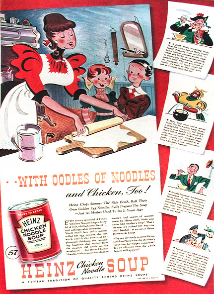
A visual sampler of the 18 kinds of Heinz soups available in 1935: Bean, Onion, Consommé, Pepper Pot, Chicken Noodle, Beef Broth, Gumbo Creole, Clam Chowder, Scotch Broth, Mock Turtle, Vegetable, Cream of Spinach, Cream of Mushroom, Cream of Oyster, Cream of Asparagus, Cream of Green Pea, Cream of Celery, Cream of Tomato. Whew! Thank goodness there aren’t 57.
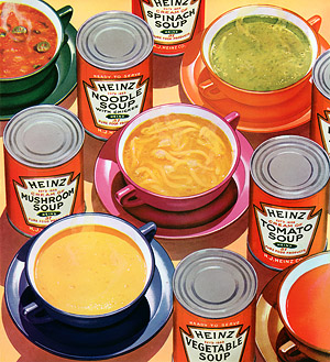
The graphic du jour is a storybook-style illustration from 1953 by Ric Howard (1912-1996), about whom we know very little except that we like his work.
TUESDAY, JULY 24, 2007
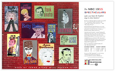
Here they are! Glittering “nights out,” right on your own TV set . . . one Saturday, Sunday and Monday night a month. Each show 90 minutes long! Captivating musical comedies — complete! World-famous stars, many lured to television for the first time. Every bit of it “live” — performed as you watch! Each show as exciting as a Broadway opening, a Hollywood premiere. All produced by television’s master showman — Max Liebman, of “Your Show of Shows” fame. Fifty million Americans will thrill to NBC “Spectaculars” in brilliant black-and-white. For those with color television sets, there's an extra thrill: “Max Liebman Presents” in fabulous RCA Compatible Color!
From late 1954 and the golden age of television comes this very appealing graphic promoting NBC’s network “spectaculars.” Today, with the U.S. population double what it was in 1954, network executives are lucky to draw half the 50 million peak audiences that NBC and CBS attracted then. Of the 11 stars “who will appear live” in the 1954-55 television season, all but two (dancer Jeanmaire and actress Nanette Fabray) are dead.
THURSDAY, JULY 19, 2007
≈
Keeping Water Out in the Rain
![]()
Masonry walls of brick, stone or concrete have long stood the test of time. But today, they can be made even better with a coating of silicone water repellents. These amazing materials prevent damaging rainwater from entering the countless tiny pores or openings in masonry structures . . .
From 1957, another appearance by Union Carbide’s Big Hand. We would love to know the story of the Big Hand — if it was modeled by an actual person (and if so, was it the same guy through the course of the campaign?), how they came up with the idea, and who thought up the various BH scenarios. The creative meetings must have been a hoot.
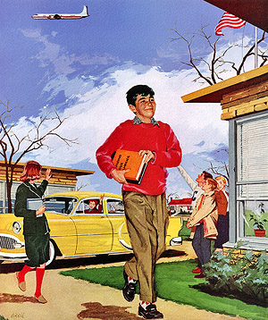
Fulfillment of the nation's hopes depends heavily on its young people . . . and on how well they are prepared in school to take advantage of opportunities for more advanced education. Our security, our living standards, are based largely upon technology that becomes more complex every day . . .
A 1957 illustration for United Aircraft by Andy Virgil, whose work and career has been chronicled by Leif Peng on his blog.
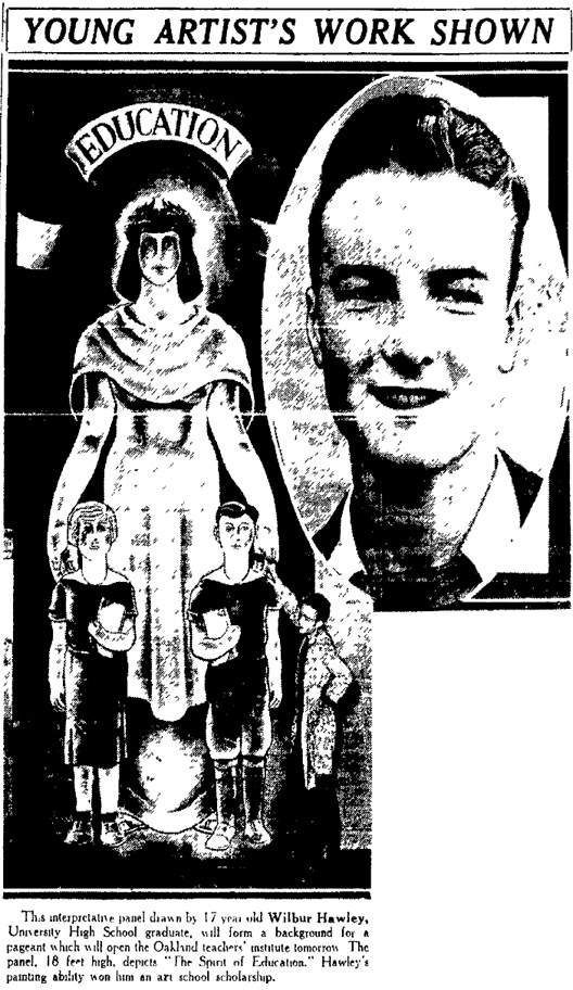
A 1960 wall plaque by Wilbur “Pete” Hawley from his cute-kids/Betsy Bell period, near the end of a career that spanned four decades. More below.
Going through the archives, I found a found few short articles about Pete’s early career. Born Wilbur Hawley on November 5, 1915, he grew up in Oakland, California, attending University High School. After graduating in 1933 he won a scholarship to the California School of Fine Arts. He died in February 1975. From the Oakland Tribune of August 21, 1933:
Young Artist Wins Honors
Since the age of 9, Wilbur Hawley, 17-year-old graduate of University High School, has been drawing things. And this penchant for “drawing things” today had won him a year’s scholarship at the California School of Fine Arts in San Francisco.
Hawley, who lives at 678 Aileen Street and is the son of Mrs. Mary Hawley at that address, first won city-wide attention when a student at the high school.
He painted a mural depicting the school, the activities of students and the “Spirit of Achievement,” which won recognition. The mural now is being shown at an Oakland department store.
Later, he exhibited his drawings and paintings with several other high school artists throughout the State and was adjudged the first artist in all the high senior grades in California. This won for him the year’s scholarship.
In addition, young Hawley has made several prize-winning posters, designed maps, candy box covers, greeting cards and other things.
Fast-forward six years to the Oakland Tribune of April 9, 1939:
Oaklander Awarded Artist’s Merit Prize
Wilbur “Pete” Hawley, 22, former Oakland youth and University High School graduate, was granted yesterday the highest honor that can go to a commercial advertising artist.
The Art Directors Club of New York conferred on him the distinctive merit award for the best design of any advertisement in a National magazine in 1938.
The advertisement, for a food concern [Heinz], was done by Hawley in his present post with W. O. Kling and Associates, Chicago advertising firm. Hawley has been in Chicago for two years.
Hawley’s former home was at 678 Aileen Street here. His mother, Mrs. Mary J. Hawley, lives at 40 Pond Street in San Francisco.
The Oakland Tribune of July 14, 1940:
Former Oaklander Is Prize Winner
Wilbur Peter Hawley, formerly of 678 Aileen Street, Oakland, and more recently of San Francisco, who is now working in Chicago, won $200, first prize for the best cover illustration in a National concert [contest?] conducted by the New Yorker
magazine. His illustration will be reproduced in the New Yorker in the near future.
A year ago the New York Art Academy awarded young Hawley highest mention for his commercial drawings for the H. J. Heinz Company. His series, using old-fashioned characters depicted in various scenes, won him the title of being the finest artist for ads in a National magazine series for 1939. The ad drawing that cinched the prize was drawn for the Saturday Evening Post last year.
While in Oakland Hawley attended the University High School
and won a scholarship to the California School of Fine Arts in San Francisco for
his mural depicting school activities. The mural now hangs in the Oakland
school’s front hallway. After attending the California School of Fine Arts he
became chief commercial artist for the Emporium and later spent two years on a
San Francisco newspaper. He is now in an advertising company of his own
organization in Chicago.
And then in the next day’s Tribune, yet another article:
OAKLAND MAN WINS HONORS
New honors were accorded Wilbur “Pete” Hawley, 24, former Oakland man and graduate of University High School, last week when he was asked to design sets for the “Political Scandals of 1940,” a play to be presented at the Democratic National convention in Chicago.
A year ago, Hawley won the highest honor available for a commercial artist, the merit award for the best design of any advertisement in a National magazine, given him for the year 1938 by the Art Directors’ Club of New York.
Hawley’s former home was at 678 Aileen Street here. His mother, Mrs. Mary J. Hawley, lives at 40 Pond Street, in San Francisco. He graduated from University High in 1933 and won a scholarship to the California School of Fine Arts.
After working in San Francisco a while, he went to Chicago, where he is a member of an advertising concern.
THURSDAY, JULY 19, 2007
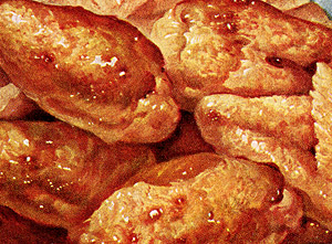
The famous flavor wrapped in red: It is the ideal that backyard gardeners shoot for every spring. It holds “degrees” from 11 leading universities. It took 50 years to bring it into being. It can trace its ancestry through thousands of cross- breedings — with each plant picked for a certain attribute it could add to the strain. The Campbell Tomato. It starts life as a seedling in Georgia. Old enough to travel, it is swaddled and shipped north to be planted in friendly loam . . .
Readers of the mass-circulation magazines of 1954 and 1955 would often turn a jumbo-size page only to come face-to-face with a tomato the size of their head. Taken together these illustrations are variations on a theme with an almost fetishistic quality a la Andy Warhol. Below, the left half of a two-page extravaganza from 1954, “The Campbell Tomato.”

Some folks like the drumstick
best,
Others choose the tender breast,
But Pabst Blue Ribbon, all
declare . . . is the
Finest Beer Served . . .
Anywhere!
Crisp, golden-brown “chicken in the basket” . . . smooth, refreshing Pabst Blue Ribbon Beer — there’s a flavor-combination to rouse the appetite of a gourmet. Teamed with any food, distinctive-tasting Pabst Blue Ribbon makes meal-time an extra pleasure. Discover world famous Pabst Blue Ribbon today!
If we had to point out one drawback to this toothsome 1954 illustration by L. Simpson, it would be that it makes us want to run right out and buy a keg of fried chicken. Pardon our drool.
In this friendly, freedom-loving land of ours . . . Beer Belongs - Enjoy It!
“Friends From the Country,” painted by John Falter in 1954, was No. 99 in “Home Life in America,” a series of ads sponsored by the United States Brewers Foundation that ran in the major magazines from 1946 to 1956. Promoting beer as America’s “beverage of moderation,” it was a also a showcase of midcentury illustrators and their art, with more than 120 paintings appearing over those 11 years. Slowly but surely we are building up a collection of enough of them to have their own Plan59 gallery.
TUESDAY, JULY 17, 2007
We’ve added 50 prints to the Gift Shoppe, and included most if not all of your requests. They can be found here and here. We’ve also upgraded our value line of prints, which are now struck on Epson Radiant White watercolor paper.

MONDAY, JULY 16, 2007
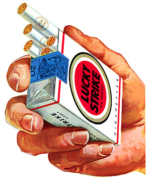
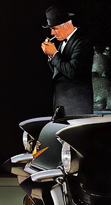
One of advertising’s most iconic images is the Lucky Strike hand, shown here in 1959 proffering one of marketing’s most famous logos — the bull’s eye designed for American Tobacco by Raymond Loewy some 20 years earlier.
≈
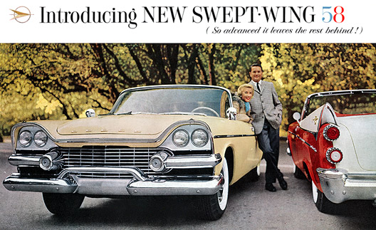
So Advanced It Leaves the Rest Behind!
![]()
A MOST UNUSUAL NEW CAR is on display for the first time. It is very low, very daring, beautifully proportioned. “Swept-Wing 58” is the successor to the 1957 Swept-Wing Dodge which launched a “buying revolution” against the high, boxy design. Significant advances include an Electronic Fuel Injection Engine, a new Constant-Control power steering system, and a vast new “picture window” windshield which curves up, back and around . . .
An illustration of two 1958 Dodges, accompanied by text written somewhat in the style of a press release. The cars, barely changed from the previous year, were among late-50s Detroit’s better design efforts.
THURSDAY, JULY 12, 2007
≈
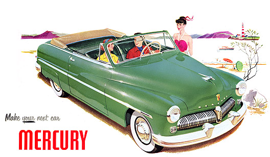
Smartest Number on the Road!
![]()
That’s what owners say about the handsome new 1949 Mercury! It’s so young in heart, so fleet in line, so bold in spirit! No wonder owners claim this long, low, handsome new Mercury is the best-looking car they’ve ever owned. For it absolutely is! Drive it just a few minutes and you’ll say: “It’s Mercury for me!”
The portly Mercury of 1949 served as the raw material for many a custom car of the 1950s, liposuctioned under the welder's torch to emerge chopped, channeled and James Dean dangerous. This green convertible represents some of the earlier work of the noted automotive illustrator Art Fitzpatrick, of Buick and later AF/VK Pontiac fame.
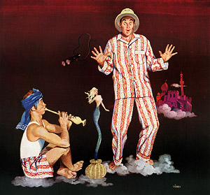
From Maine to Morocco everybody goes for comfortable, handsome Textron Menswear. Textron’s super pajamas in finest rayons have roomier armholes, anti-bind trousers. Textron’s boxer shorts have the famous “parachute seat.” Casbah rayon pajamas, $6.95. Matching boxer shorts, $1.65 . . .
A 1949 pajamarama illustrated by Frederick (Fritz) Siebel (1913-1991), who as an account executive launched the Mr. Clean campaign for Procter & Gamble. He also illustrated the Amelia Bedelia books.
FRIDAY, JULY 6, 2007
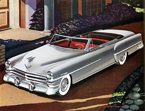
In presenting the 1953 New Yorker to you, we do not want to let our enthusiasm run away with us. But it is going to be difficult, because we are so genuinely enthused about the magnificent results our designers, stylists and engineers have achieved in creating a car that is as beautiful as it is finely engineered. We think it is the most beautiful Chrysler ever designed . . .
An illustration by Larry Baranovic from the 1953 Chrysler sales brochure, one of the nicer pieces of large-format midcentury auto literature along with the 1954 and 55 sales catalogs. This one, Form CS-299, printed in October 1952, came with credits: Format (layout) by Gene Merecki of Canfield Associates, Detroit; Typography by A.C. Arnold of Arnold-Powers, Detroit; Art by L. Baranovic, Detroit; Lithography by the Regensteiner Corp., Detroit.
PREVIOUS POSTS (JUNE 2007) • SITE © 1999-2020 PLAN59.COM
